 Laura Hayes and John Howard Wileman Exhibit of Optical Toys website, im my opinion, is a simple yet informative website. I like that it isn't crowded and is point-on. I also like that you click on the image of the toy to get more information about it instead of clicking on a bunch of worded links. My favorite toy on this website is the Chromatrope. The Chromatrope can project kaleidoscopic patterns. It has a mechanical slide so there are moving parts inside the Chromatrope that create the different patterns. All of the discs inside the Chromatrope turn when you rotate the exterior handle that turns the gears inside that turn the glass discs. The glass discs are painted with designs and can be projected onto a wall. I found this site really interesting because I learned many things and I didn't know about some of these toys. Click HERE to visit the site.
Sunday, December 7, 2008
Optical Devices
Laura Hayes and John Howard Wileman Exhibit of Optical Toys website, im my opinion, is a simple yet informative website. I like that it isn't crowded and is point-on. I also like that you click on the image of the toy to get more information about it instead of clicking on a bunch of worded links. My favorite toy on this website is the Chromatrope. The Chromatrope can project kaleidoscopic patterns. It has a mechanical slide so there are moving parts inside the Chromatrope that create the different patterns. All of the discs inside the Chromatrope turn when you rotate the exterior handle that turns the gears inside that turn the glass discs. The glass discs are painted with designs and can be projected onto a wall. I found this site really interesting because I learned many things and I didn't know about some of these toys. Click HERE to visit the site.Tuesday, November 4, 2008
Pinhole Photography
For our Cyber Arts trip we went to Gallery 44 to learn about Pinhole Photography. There we learned how to make Pinhole Cameras using a container, a pin, a tart tray, some electrical tape and tin foil.
What is pinhole photography? Well pinhole photography is where you use pinholes to take pictures/photos. The pinhole would be your aperture and the electrical tape on the pinhole would be your shutter.
To create the camera we first got a container (coffee containers work) and spray painted the inside black. We then cut a circle on the side. We took a tart tray and cut out the bottom so it was a circle. We taped the tart tray circle on top of the circle on the side of the container. We took a pin and drilled a small hole into the tart tray circle. We took a piece of electrical tape and used it to cover the pinhole. After that we went into the dark room and placed a light sensitive piece of paper and put it inside of the container, opposite of the pinhole. We took some tinfoil and placed it on top of the container and sealed the lid of the container on top so no light would get in. We went outside and took pictures. How you may ask? Well we placed the camera where we wanted it (Pinhole facing the object or place we wanted to take the picture of). We took off the tape so light would come into the container and onto the light sensitive paper. After letting it sit about 1 and a half minutes we put the electrical tape back onto the pinhole and went to the dark room to develop it.
I really enjoyed the trip. The most exciting thing on the trip would probably be getting to use the dark room as it was my first time. I learned how pinhole photography works and overall it was an awesome trip. Below are some of the pictures I took using pinhole photography.
 "Bike"
 "Down the Alley"
 "Fall Building"
If you would like to see more pinhole photos visit ALEXIS RAGO's portfolio. She has many photos and some more information about what pinhole photography is. I really liked this site and I recommend you to check it out too.
Friday, October 31, 2008
Light and Shadow
 My Photograph shows Light and Shadow. It shows light and shadows because you can see the darkness and lightness in the picture outlining me on the wall. The picture shows depth. This photo also shows texture on the wall. You can tell that the wall is rough.
Texture

My photo shows texture. It shows texture because you can tell that it is prickly just by looking at the image. You can clearly see the pricks on the tree.
Lines

My photo shows lines. You can see horizontal and vertical lines in the building in the background and you can see diagonal lines in the grass. This photo also shows rule of thirds.
Rule of Thirds

My photograph shows Rule of Thirds. the sky takes up more then half of the photo while the busier part in at the bottom. The bottom part has cars and buildings in it and they are not dead in center of the photo.
Center of Interest

Thursday, October 16, 2008
Photo District News Article
The Girl Project Lets Teens Reveal Their World
This article talks about something called "The Girls project" For this project Kate Engelbrecht (a New York-based photographer) sends a Kodak camera to any girls ages 13-17 in America that want to do this project. The girls then photograph things that are meaningful and special in their lives. The goal of this project is to get photos from 5,000 girls of different backgrounds and cultures in America and then sort the pictures out into a book and traveling exhibition.
This topic is worthy of having an article about it because many people, adults especially, have a certain image about young girls. This project is to show what girls are truly. The girls in the project are sending in photos of nature, text and much more.
I found this topic really inspiring. If these girls can take a camera and express who they are without words and without media. These girls are expressing themselves in an interesting way. I would love to do that. Its a way of opening up and finding yourself.
I think this exacally what I want in a photograph. I want meaning in my photos. I don't want to take a picture of a tree just because I think its pretty. I want to take pictures knowing there is more to that then just the object, I want to know that there's a feeling, mood or reason behind that photo.
CLICK HERE TO READ THE ARTICLE
Graphic Design Link
For our Cyber Arts assignment we were asked to find a informative, educational or inspiring website. For my assignment I chose to write about OUTSPOKEN KATE I chose this website because it is a informative, educational and inspiring website. This website has tutorials for design programs (like photoshop and paint shop pro), tips on designing websites and pre-made graphics. When looking through this website I learned a number of different skills. I also got amazingly inspired and got a bunch of new ideas. If you would like to learn about coding, graphic programs or web designing I recommend you check out outspoken-kate.com

Wednesday, October 15, 2008
Composition in Photography - Mood
Mood is the feeling a picture invokes. A photographer can portray their mood or a mood they want the viewer to feel by photographing different elements. Specific elements evoke different feelings. For example an image of the sun and a blue sky can convey warmth and happiness. Fog might convey anxiety or mystery. One person may feel something different when seeing a picture then another depending on who they are.
Here are some examples:

By Arie V.D WoldeM

Here are some examples:
Composition in Photography: Selective Focus
What is Selective Focus?
Selective Focus is when you put emphasize or isolate one main part of the photo by using depth of field. One thing in the picture stands out while the background is either blurred or dull. To create selective focus you can use larger aperture to reduce the zone in front and behind of the main focal point.
Here are some examples.

(c) Veronika Vasilyuk

(c) Susan Fox
IMAGES FROM SHUTTERSTOCK
ARTICLE ON SELECTIVE FOCUS
Selective Focus is when you put emphasize or isolate one main part of the photo by using depth of field. One thing in the picture stands out while the background is either blurred or dull. To create selective focus you can use larger aperture to reduce the zone in front and behind of the main focal point.
Here are some examples.
IMAGES FROM SHUTTERSTOCK
ARTICLE ON SELECTIVE FOCUS
Thursday, October 9, 2008
LOGO ASSIGNMENT

 For our 3rd Cyber Arts Assignment we were asked to design a logo that would represent our company. This is my final result with both my topography and pictography.
My company's name is "Divine Designs". I chose this name because it goes with the butterfly very well. I chose to use a butterfly to represent my company. I chose a butterfly because butterflies are graceful, elegant, colourful and pretty. My company specializes in Graphic design, Website Design, Website Coding, billboards, posters and much more. We believe in taking our works to great heights.
My logo consists of straight and curved lines. The curved lines give my logo a soft feeling while the straight lines give it strength and balance. The shape of the butterfly is an outline of an actual butterfly and none of the structures of the butterfly is distorted. The colours I used for the butterfly are black, white, red, pink, orange and yellow. These colors stand for elegance, passion, simplicity, ambition, sweetness and warmth. For the text I used A normal font and warped it so it curved into a smiley-face shape. I added some lines coming out from the D and the E in Divine Designs and positioned them so they went around the butterfly. At the end I added a drop shadow, completing my logo. I am very proud of my logo.
Sunday, October 5, 2008
Chess Piece
 For our second assignment in Cyber Arts we were asked to draw a chess piece using Proportion, Value and Movement. I chose to draw the Queen.
First I drew the chess piece in the middle of the paper tilting to the left. I then added triangles, swirls, circles, squares and lines (in different thicknesses) to form the background. In the background I divided the page into two, with the chess piece in the middle. On one side I added two striped triangles and added three to the other side, I made one triangle bigger on the right part so it would balance the drawing.
After that I added value to both the chess piece and the background which added weight to the drawing. In the background I added mostly White, gray, white, gray patterns to the lines, triangles and swirls. I shaded the sides of the small circles in the corners so they would look 3D.
For the proportion I used an actual chess piece, measured the main parts and multiplied the measurements by three so the image of the chess piece would be enlarged. This is how I made sure the proportion was accurate.
There is also movement in my drawing. The triangles and swirls draw your eyes around the drawing while the diagonal lines move your eyes across. After drawing the picture I took a photo of it and uploaded it onto the computer. Then I opened the image onto Adobe Photoshop and adjusted the brightness and contrast, thus creating my final outcome.
Thursday, September 18, 2008
Painting Critique

For my Cyber Arts class we were asked to write a critique of an image in Imitationalism, Emotionalism, and formalism perspectives. I chose the Sleep Nassau by Winslow Homer for my assignment because It is an eye-catching piece and I think the blue in the painting looks beautiful.
If I were to look at this painting in an imitational perspective, I would somewhat like this painting because it doesn't look very lifelike, yet it looks somewhat real. The Ocean looks a bit rough and the clouds look a little flat. The boat and people however look realistic and 3D as if you were on the shore or perhaps the ocean looking at the boat and the people on it.
If I would look at this painting in a Emotionalism perspective I would find this painting very calming to the eye because of the dull grayish-blue colours used in the right upper corner in the sky. It gives you the feeling that rain is coming. When it rains you feel calm so the calmness is reflected in this painting.
If I were to look at this painting in the formalism perspective I would really like this painting. The light and dark colours balance each other so nothing seems out of place. The artist used both soft and rough strokes in different tones of blue and green to make waves creating movement in the ocean. The grayish blue sky then balances the movement. The boat and people in the middle then completes the painting.
In my opinion this painting is beautiful with it's details and colour choices. Remember, everyone has their own perspectives and points of view but I would like to thank you for taking the time to read mine.
Thursday, September 11, 2008
Some Old Graphics
Hi! I was going to through some of my old graphics and found some that, In my opinion, looked pretty good. I had posted them all to my creations site but I closed it down a few months ago So I thought I would post them here. I hope you enjoy, I've spent a lot of time on these. You may click on the images to enlarge them.
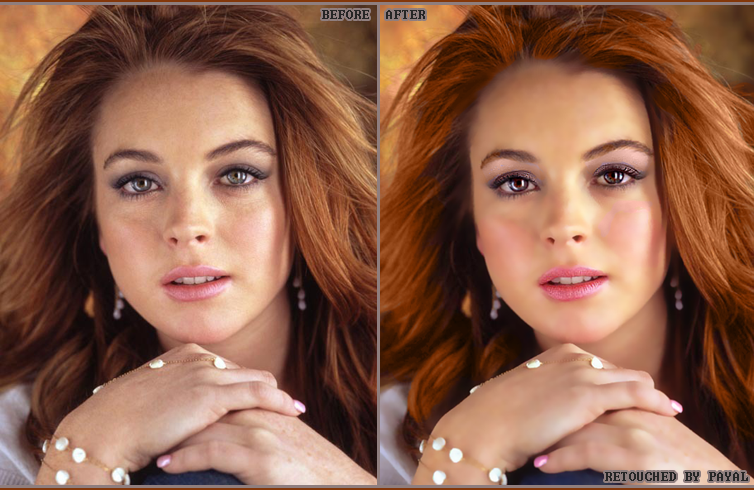
The image on the top is one I did last year of Lindsey Lohan. I added effects softened up the skin and made it look.. better, I think.
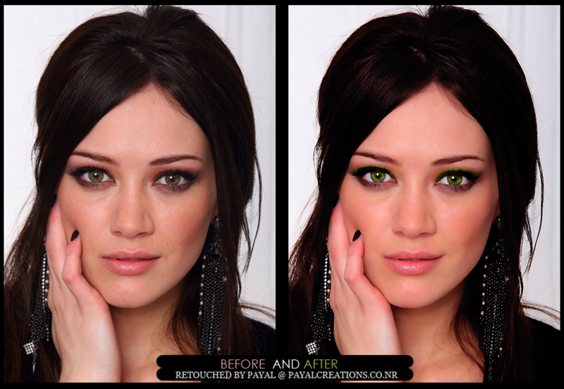
This retouch on top I made a few months ago for a challenge site. I'm actually pretty happy with the result.
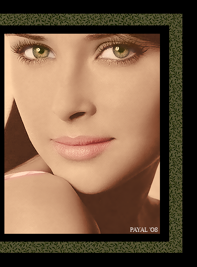
This is a colorization I made last month. A colorization is a black and white image that is colored using programs like Adobe Photoshop. I was really very happy with the outcome. Especially the eyes. I entered it in a challenge site and won Platinum!
The image on the top is one I did last year of Lindsey Lohan. I added effects softened up the skin and made it look.. better, I think.
This retouch on top I made a few months ago for a challenge site. I'm actually pretty happy with the result.
This is a colorization I made last month. A colorization is a black and white image that is colored using programs like Adobe Photoshop. I was really very happy with the outcome. Especially the eyes. I entered it in a challenge site and won Platinum!
Hi!
Hi! welcome to my blog! This would be my first entry. I'm very excited to be opening this blog and will be posting about 1-2 times a week. Here you will find my work, drawings, pictures, graphics and many more. So I hope you enjoy! Also, I would love your feedback! So leave a comment if you want but please, if you don't like my work you can leave, I don't want any hate messages. Thank you.
Subscribe to:
Posts (Atom)