Welcome to Payal's Blog! Here you will be able to view my Work, Designs, drawings, photographs and graphics. I hope you enjoy your stay and feedback is loved.
Hey guys! For today's CyberArts seminar we started working with a program called SketchUp. It was very difficult because I had never used the program before. So we basically had 20 minutes to try and make our own personal chairs. This is what I came up with.
I think that my first try was pretty good because the using the program was very difficult and I managed to make decent looking chairs. So I'm happy with the outcome. :)
Well, today I'm going to write about my second CyberArts art assignment; the romanticism collage.
For this assignment we were required to chose to make either a dry print or collage focusing on the theme of romanticism; I chose to make a collage.
The idea behind my collage is "the ignorance of class." It shows a poor boy isolated from the life of a middle or high class society. My collage revolves around the idea that the higher society has so much (money, cars, brand named clothing, education, food, etc) but some of us don't think about those who don't have anything at all. We hear about poverty on TV or read about it in the newspaper; but do we do anything about it?
My piece shows romanticism because there is a lot of drama, emotion, and contrast in my collage with one main focal point. You can see the drama and emotion by looking at the focal point; the large image of a poverty stricken boy which I placed at the bottom half of the collage. His expression is intense; it looks as if he is looking at you accusingly; his stare makes you feel uneasy. I placed him at the bottom on the collage because I wanted to separate him from the overlapped images of the higher society; this shows that he is isolated.
The focal point is contrasted with the top of the collage. The bottom is dark and dramatic; the colours I chose from the bottom were very neutral with blacks and browns with a bit of white. The top of the collage however is very bright with a wide arrange of pictures and colours; this symbolizes a happy wealthy society.
The composition I chose to use was the rule of thirds. I wanted to compare and contrast the two different classes but decided that simply dividing the board in half would not add interest to my piece. This is why I made sure that the top half (or the wealthy class) was about a centimeter higher than the center line. This instantly made my piece look better. Finally, to unify my piece I cut up small pieces of text from a magazine and overlapped them underneath all the pictures; I also added a strip of text at the bottom of the collage so my piece would feel balanced.
I am very happy with the end result of my romanticism collage. I hope you liked the outcome too! :)
I was online again and I found a article of 39 really cool photo manipulations! What is the definition of a photo manipulation? Well, according to Wikipedia a photo manipulation is "the application of image editing techniques to photographs in order to create an illusion or deception (in contrast to mere enhancement or correction), through analog or digital means."
Out of these 39 photo Manipulations, I wanted to share 2-3 of my favourites and tell you why.
This is the first of the three photo manipulations I wanted to show you. I really like it because it has a cool feel to it and I think that its really interesting. I love how you have the illusion of a man drawing an image of his legs but his legs look like they are attached to the rest of his body making the picture look like a whole.
This is the second photo manipulation I chose to show you. I found it creative because the artist makes the face of this boy seem as though it has the texture of a pillow. They made it as so the impact of the punch has a entirely different outcome than that of reality.
This is the third and last photo manipulation I wanted to show you. This picture, I thought, was very witty. This is because you can see that this person tried to catch a vase from breaking, but broke themselves. It's almost like a reverse situation and I thought that was very cool.
I found that these photo manipulations were really creative and made me feel a round of emotions. Some of them were mind-boggling, others disturbing and some were very witty or clever. I recommend that you check them out. If you would like to see the other 35 photo manipulations, CLICK HERE.
I just came across the coolest video ever! Its about a company called "Resource Furniture." Resource Furniture specializes in creating space saving furniture. They create fold up furniture that is multi-purpose and very convenient.
I believe that these designers are very skilled at their trade because the amount of knowledge and problem solving skills needed to design this type of furniture must be enormous. These designers manage to make one type of object into another in such an efficiant way. For example; they attached a table to a wall that can be pulled down into a bed. But that's not all, the table itself does not have to be cleared and moved, the table folds itself completely under the bed; its contents still untouched.
If your still confused on what I mean; check out this video!
After watching that video, are you as amazed as I am? I would love to know your thoughts! For more information you can check out the Resource Furniture website HERE.
Well, It's the middle of march break and I am completely bored! haha. It's basically one of those days where you end up spending all your time online because you don't have any plans for the day. Yup, its one of those days. Anyways, while I was sitting here bored, I realized that I am completely behind on my blog posts; oops :S.
So today, I have brought to you a tutorial I stumbled upon earlier this evening. This tutorial was written by Dave Cross in 2009 and I thought It was pretty interesting. Basically, he took a well contrasted picture and made it into a portrait made entirely of text through Photoshop CS4.
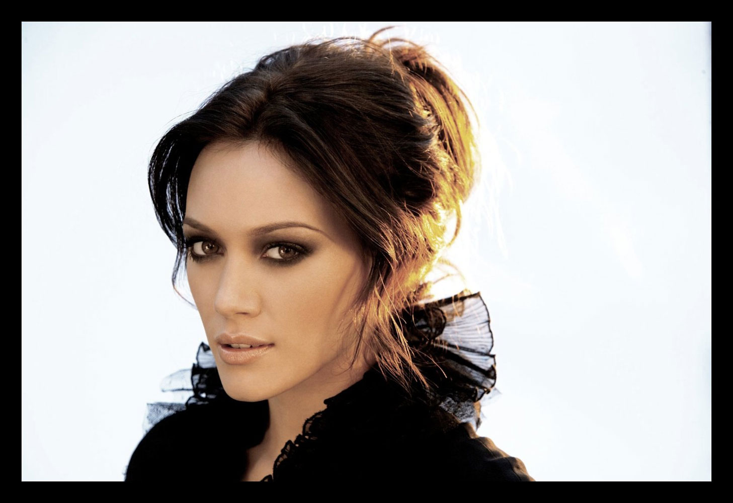
Cool right? I thought it was very interesting and being a Photoshop lover myself [haha], I decided that I wanted to make a portrait following this tutorial myself! So I took THIS picture of Hilary Duff which I found HERE and got going! Since this picture did not have the amount of contrast I required, I needed to use Photoshop to enhance the lights and darks of the portrait. Following the tutorial was not hard because the wording wasn't confusing and there were pictures to help explain the steps. In the end, this is how my portrait turned out!
I admit it's not as professional, but I thought It looked well done especially because I added some effects of my own. So personally, I liked how my portrait turned out in the end.
If you guys are interested in making your own portraits made entirely of text, please do visit THIS TUTORIAL and try it out. I would love to see the outcome! Good Luck!
Hello again! I know I've been promising to put up my edited trailer for a while now so here you go!
For those of you who haven't read my past posts, for my first CyberArts tech. assignment we were required to take a movie/game trailer and change the mood of it by altering scenes, music and sound Fx! For my trailer, I chose to remix the trailer of a 2011 Disney feature called 'Tangled'.
Before I go on about my remixed trailer I would like to show you the original trailer. I actually used 3 different Tangled trailers for this assignment but I will show you one and give you the links for the two others. :)
The Original
You can see the other two trailers here and here. :)
Now here is my Remixed Trailer.
As you saw, the original movie trailer is a romantic comedy with adventure. It makes you feel happy and wants to make you laugh.
For my remixed trailer I decided to change it to make the viewer feel a range of emotions; happiness, suspense, drama and intensity. The original story was of a kingdom thief meeting an interesting and magical girl that had been 'grounded' in a tower [hidden] for about 18 years and how she is taking an adventure with him to find her freedom. My story however is about a kingdomthief who falls in love with a girl in a tower, they fall in love. But the girl betrays him and sends him to jail. Now, he is angry and hurt, he breaks out of jail and takes an adventure to find this girl and take revenge.
I had a lot of fun with this assignment. It was fun cutting and pasting scenes to create a whole new story. The hardest part of this assignment was finding the right music to fit the scenes; it was even harder for me because I had to choose three different songs with different moods. That, I found, was the most time consuming. Sound effects were pretty easy but transitioning them was tricky.
All in all, I like my end result. I really liked how my music really went with the scenes and movement as well as transition. If I had more time, I think I would have edited the voice overs a little more and made them sound better.
So I am here today to talk about my first art assignment for year 3 CyberArts! :) For this assignment we were put into four groups. Each group had a big piece of paper and pastel. We were required to draw images on these pieces of paper based on a chosen quote; we rotated as we did this for a end result of four random large scale doodles/drawings. From these four sheets of drawings, we had to crop an image with good composition. After we chose a cropping with good composition we had to make a large scale pastel, large scale painting and small scale painting based on the cropping.
I unfortunately lost my original small cropping so I am not able to show it to you. :( But I think you'll be able to have an idea of what it looked like from the two pieces that I chose from this assignment. My cropping followed the Golden mean composition.
The first piece I chose was my large scale painting. This painting is one of my favourites because I loved the free-hand feel of painting it. I liked how it didn't require too much detail; I just needed to take a thick brush and go at it! When I started out I didn't pay much attention to brush strokes, but as I got to the last layers I thought it needed something more. So, for the green top layer I played around with brush strokes by dabbing thick paint in different directions to make it more interesting.
I came across some challenges as I was painting this piece. For one, I couldn't add a lot of blending because my original cropping was very solid in terms of colour; this made my painting look a little simple. Another challenge I faced was drawing the bright pink lines; I needed them to be perfectly straight but it was really hard because I had a very thick brush and so the lines became thicker than I had originally planned.
If I were to change something about this painting, I would change the shade of green I used for the bottom half of the painting. This is because It was a cool colour but it did not entirely match the tone of the green that was in my cropping. The second piece I chose was my small scale painting. I really liked this piece because I had more control with my brush strokes. Since this was a smaller scale painting, I was able to add more detail in it that I wasn't able to in my pastel piece or my large scale painting.
Unlike my large scale painting, I added some interesting textures and colours to my smaller painting. For one, almost all of my brush strokes (except the straight pink lines) were in all different directions. To make the painting more interesting, I dry brushed over the purple and green parts with black paint; this added an interesting texture to the painting.
I didn't have many challenges with this painting specifically. This is because I had more control with my brush. The only part I had a bit of difficulty with was, again, the straight hot pink lines that I couldn't manage to make perfectly straight.
I hope you liked my pieces! I think my favourite would have to be the small scale painting!
Hey guys! Today I will be critiquing two music videos; a good one (in my opinion) and a bad one (in my opinion). I would love to know your thoughts about it afterwards!
The first video is chose to critique is Fireworks by Katy Perry.
This is an example of a good music video. The song was very inspiring and the video matched it perfectly. The song is all about inspiration, hope, belief and the need for change. I loved how the video showed a variety of different scenarios and different characters facing different situations that they needed to overcome. I felt that it was very effective because the song is about how you can make a change and the video showed these characters overcoming their situations by standing up.
I also liked the fact that the video wasn't distracting the viewer from the song itself. There weren't any unnecessary graphics or effects. The effects that were shown [the fireworks and sparks coming out from the individual's bodies] added the effect of power. It wasn't randomly there; it had a purpose. I really liked this music video.
The second music video that I will be critiquing is Your love is my drug by Ke$ha.
This would be an example of a bad music video. This video is completely random and unnecessary. For one thing, it does not make sense AT ALL. In the song, she sings about how "his [her boyfriend I'm guessing?] love is her drug." So it's basically like a love song; she talks about how her mother and friends don't approve of her love and she's confused because she can't get him out of her mind. The video however shows her in a desert, she's randomly dancing, crouching on the ground with a tiger mask on making weird poses and riding elephants. Then is shows her in a canoe, on the sand, as her boyfriend [?] pretends to paddle. Then to top it off, she is shown with a glow in the dark suit and paint on her body [face and all... still in a desert] trying to make [alluring?] poses. SPLAT, an unnecessary graphic animation. She then ends off the video with one sentence; "your love... your love... your love...your love is my drug. I like your beard." WHAT?
The music may be catchy but the music video is a horrible mess. It does not make any sense and is totally random. This video gets a huge thumbs down from me. What were they thinking?
I hope you liked my post. If you have any opinions about the videos I have chosen or my critiques please do leave a message. I would love to know what you think. Also, if you have any examples of good and bad music videos that you would like to share, do post them in the comments below. I'd like to see them! :)
 I think that my first try was pretty good because the using the program was very difficult and I managed to make decent looking chairs. So I'm happy with the outcome. :)


