Friday, April 23, 2010

Louis Comfort Tiffany

Hello!

Today, well I was searching up some Art Nouveau style paintings for my assignment I came across an artist that I found very interesting; Louis Comfort Tiffany.


Louis Comfort Tiffany was a painter, Interior designer, collector, world traveler, photographer, manufacturer and avid gardener in his time. Though his father wanted him to succeed him as the head of their company (Tiffany & Co.), Tiffany's real interest was painting. Before becoming a established artist in 1879 Tiffany studied under an American landscape painter named George Inness through the 1860's and 1870's.

In 1879 he joined with other artists to form a firm that would use aesthetic idealism in the practice of interior design. He used stained glass windows in these designs. Tiffany earned international reputation and earned success.


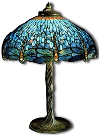
Tiffany started experimenting with glass in 1875 to 1878 as he was working with glasshouses in Brooklyn. This is when he started designing glass-work. His unique style was the one of Art Nouveau which contained of organic shapes, flowers and leaves. On Dec 1st, 1885 he opened "The Tiffany Glass company" which later became known as "Tiffany Studios." He designed glass table lamps, lampshades, glass vases, tiles, mosaics and stained-glass-windows. Tiffany died in 1933 but his amazing Art Nouveau designs are still known today.

Magnolias, c. 1900
Louis Comfort Tiffany
glass, lead

I really enjoy Tiffany's work because it is different. It's amazing how he incorporated the Art Nouveau style into his work; stain glass windows, glass vases, glass lamps. It's amazing. This really inspires me because I am currently working on an assignment in my CyberArts tech. class that has to do with Art Nouveau and it's hard. There are so many organic shapes and so much detail. I have so much respect for Tiffany as he probably worked very hard to get such results!

Louis Comfort Tiffany was an amazing artist.

Wednesday, April 21, 2010

Sprockets Film Festival

Hello Everyone!
Yesterday, my CyberArts class and I went to the Sprockets Film Festival at the Sheppard Cineplex Odeon. There, we watched a series of short films made by Film School graduates and students. These films included a variety of different genres such as animation, documentary and more. After watching these short films (and having lunch), we watched a animated french film called "U".


At the sprockets Film Festival we watched a series of short films; Animal, The Art of Drowning, On the Bus, Forget myself, The Freshwater Plague, Toxic Ingredients, Bonefeather, Iran: A Nation of Bloggers, Nanu and S'oublier. In these films I liked that each film had a different theme, they weren't all the same. I also liked that most of the films had interesting shooting angles. One thing I couldn't help wondering is how they made the animations. Some of the animations were pretty long so I wonder how long it took them to make that 5 minute film, or that 3 minute film. When I watched the film "the art of drowning" It looked really complicated. The maker of the film was also there at the screening and so one of my friends asked him what medium he used. He told us that he used mostly a pen/pencil and paper. Thinking of that it makes me wonder how exactly the makers had patience to make their films. The non-animation films also make me wonder, how they thought of the concepts and how they made their film with the little equipment they had. It's interesting when youthink about it. My favourite film out of these would have to be Bonefeather. This is because it had humour to it and it made me enjoy the length of time I was watching it! The theme of two obnoxious birds fighting over a female bird was very entertaining. It had the whole audience laughing. It was a good pick me up. I also liked the the film included bright colours for the birds to give it a bright and cheerful mood. I have yet to guess what type of medium was used.


The second film that I mentioned we watched was called "U". It was about the friendship of of two beings. A princess named Mona and a unicorn named "U". When Mona was a child she was often upset because she had to listen to the rantings of her guardians (her parents had died earlier), she felt that everything was her fault. Then one day, crying, she met a unicorn named "U". From then on they became sister-like best friends. A couple of years later they meet a family of travelers called the "Yeah Yeah's" which include four siblings and their mother and father. Meeting one of the sons of this family, a musician cat, she finds out what love is. But being in love causes a drift between her friendship with "U"...

I personally really liked the film "U". I can say this french film is different then the western animations we have today. "U" was a bit more open and descriptive with its content. For example; at one part it described kissing. This is different from Western animations because most western animations are meant for children and do not show mature content. Another more obvious difference would be the language. The film used french while western animations mostly use English. There are probably more differences but I fail to see them at this moment, looks like I will have to watch some more animations and compare.

Wrapping it up, I can proudly say that I thoroughly enjoyed my day at the Sprockets Film Festival!

Friday, April 16, 2010

Old Coca-Cola Or New?


Hey Everyone!

I opened my fridge the other day and took out a coke can. I picked it up and looked at it. Then I thought, "didn't it look different before?" So I searched it up and found an images of the Coca-Cola can, before and after. This is what I came up with.

So I looked at the two designs and I think I like the first design better. The new design is nice, but its too simple in my opinion. I preferred the old design because It looked more "WOW". For example, I liked how the old Coca-Cola can used more then one colour with different shades; red, maroon, silver, white, yellow and black. I think it just looks more visually appealing. It looks shimmery and I love the bubbles and patterns on the can. I like it because it's not overly decorated, but it gives the can more character.

I think the newer can isn't as appealing. The only exciting thing about the new can, in my opinion, would be the bold cursive writing.

I think the Coca-Cola company should bring back the old can! :)

Stop Motion Animation

Hello Again!
I was recently on our CyberArts main blog. While looking through some old posts I came across some stop motion animations my CyberArts class and I made at the NFB. Looking at these animations I thought, wow. That took us a long time to make these 10-15 second animations. So I went onto youtube and started looking at random stop motion animations. Some work short and some were long, but all of them were thoroughly entertaining!

One animation I really liked was about a wooden stick figure.

Do have a look!


This animation was about one minute long and was pretty simple. It was done on a white background. The animation was about a stick figure that wouldn't stay in the position that the maker wanted. So the maker (his hand) would come in frequently and try to position the stick figure and make him stay properly. But the stick figure would change it's position. It showed the stick maker getting angry and the stick figure eventually crawled away.

I thought this video was entertaining and funny. It made me laugh. Just the simplicity had a good impact on me because there weren't any thing to distract my eyes away from the main animation.

I hope you enjoyed it! :)

Saturday, April 10, 2010

Photoshop Tutorials :)


Hello Everyone!
I'm here with a bunch of Adobe Photoshop tutorials I have found on Outspoken-kate.com. Outspoken-kate.com in a blog written by a 20 year old girl named Katya. I stumbled upon her blog about a year or two ago when I first started using Photoshop. This blog was a lot of help because it covered a lot of the basics; adding text, blending images, using patterns and so much more. So if you have recently started using Photoshop and don't exactly know how to use it, this blog or website will guide you through some useful steps.

The thing I like about these tutorials is that they include pictures with the instructions. So if you are confused with the wording, you can figure out the problem by looking at the picture. Also, if you do not know if you are following the instructions correctly you can refer back to the images and see if your work and the tutorial images look the same.

I find this blog/website very useful. If you want to learn some cool Photoshop effects or need some simple tutorials, do check out this blog! (You can click on the link above)

Monday, April 5, 2010

Touch the Sky :)


Hello Everyone!
So, last week on Thursday, I went outside to help my two friends take pictures for an assignment we are working on in CyberArts tech. We took the pictures and on our way back to the school we started jumping and taking random photographs.

This is one of the photographs my friend took of me while I was fooling around just jumping. It was beautiful outside so I had a lot of energy. So I guess I jumped pretty high looking at this photo. I didn't really know what this picture turned out like until my friend showed me it on her computer. I immediately transferred it onto my USB key and brought it home. After that I opened it onto Photoshop and did some colour correction using levels, colour balance, brightness and contrast and selective colour. After that I added some wording to the top left corner and there you have it!

I really like this photo because its very surreal, it goes against gravity because it looks like your just floating in mid-air and its funny because I didn't really plan it. You're just jumping up and down and whatever the camera captures, it captures. It's very random, and so that's what I like about it.

I hope you like it and I hope you try it one day! Just grab and camera and shoot while your in motion. It's totally random and you might have some laughs along the way when look at any ridiculous poses that turn up! So Have fun! :)