Monday, June 21, 2010

Stunning Sari's and Sensational Suits


This week, my mother and I were looking through catalogues of different saris and suits. While going through these catalogues I couldn't believe how beautiful some of the saris were. There weren't just one style or material; there were so many. Within these long pieces of fabric, there were sequins and beads sewed as well as embroidery.

One thing I like about these sari's is that they are like pieces of artwork. All of them have different kinds of embroidery, they are all unique in their own way. I love all the different styles of sari's and suits they have.

I looked at many, many different sari's but I couldn't choose a favourite because there were a lot that popped out at me. But If I had to choose one or two it would be the silver and pink/redish one above and the pink/redish and blue one to the side. I really liked the way they were embroidered and I also love the style of them. The colours are bold too so they pop out nicely.

My favourite suit out of all of them would probably have to be the green and red below. I like it mostly because of the pants that go with it. I love how they are puffy/volumed. It's a really nice style apposed to the skinny legged suit bottoms they came out with last year. It's refreshing to see a whole new style coming out.

If you are interested in looking at different types of sari and dress styles; check out the Silk Museum Website.

Sunday, June 20, 2010

Stills and Motion

Hi Guys!

Today, I was sitting with my 7 year old cousin watching the Family Channel. After watching an episode of 'Sonny with a Chance' I was about to get off of my coach and do something productive when I suddenly heard a blast of music and then I saw them, Demi Lavato and Selena Gomez singing the song 'One and the same' from their Disney Original 'The Princess Protection Program'. My cousin seemed to love this song, so I sat down again and watched it with her; to my surprise I realized that the music video (and the song) was pretty good so I thought I'd share it with you!


In my opinion, this music video has a lot of cool video effects. I love how they cropped out clips and showed them in the frames that Demi and Selena were holding. The video wasn't made of one style. They used different things; stop animation, effects and plain video.

My favourite part of the video is when Demi and Selena are holding frames (with an empty middle) in their hands and making faces. They poke their head into the frame second and it goes through, when they bring it back their faces turn into actual pictures. I thought that effect looked really cool.

Check out the video! I hope you like it!

Mazes of the Mind

Hello Everyone!

I just wanted to share my El Anatsui piece with you. I had been working for it for about two months now and I am finally finished! This piece is packed already and ready to be sent to the ROM but I took a picture before so I could show you all! :)


The title of my El Anatsui piece is called “Mazes of the mind”. The theme behind it has to do with the walls of hatred; how when you are so mad at something or angry at the world around you that you build so many walls around yourself that it create a maze. When the walls become a maze you have to find your way around them, find your conscience and then find your way out to the real world.

My piece is mostly transparent so you can see through to the other side. One side of my piece consists of a happy, normal world with a white maze around it; this represents that you can conquer the maze and found you way out, people will accept you again. The other side is the opposite; it shows a dark blood red and black world with a black maze. This represents the fact that you may not want to break out of the maze of hatred and if you do, the world and the people in it may not want to accept you anymore because of the things you have said or done.

Since my piece is transparent, I placed a person and their conscience on two different sides of the piece. It seems as they are on the same side but really, there is a barrier between them.

My concept includes many questions within questions. It makes you think because there are two scenarios to it and it depends on who looks at it and what their point of view is. You do not know the conclusion until you think about the actions. My piece has a simple design but it has a maze of thoughts around it.

FREEDOM

Hello Everyone!

For a project at school we were asked to create a t-shirt design that reflected and represented an article from the Universal Declaration of Human Rights.

For this design I chose article #18; everyone has the right of freedom of thought, conscience and religion; this right includes freedom to change his religion or belief, and freedom, either alone or in community with others and in public of private, to manifest his religion or belief in teaching, practice, worship and observance.


My idea behind my design is that everyone should accept that there is more than one kind of religion and belief and everyone should have the right to carry them out without being judged or punished. My design has the word "FREEDOM" In large letters in bold and underneath that word I have 3 words that summarize the whole article; thought, conscience and religion. Beside it, I have a man and a women praying but it is not defined which religion they follow because there are symbols of a lot of different religions. I am trying to convey that all religions are different but it shouldn't matter which one you follow.

I hope you like it! :)

Thursday, June 17, 2010

Andy Warhol

Hi!
Today I was searing the web for interesting pieces of art and artists and one famous artist caught my attention; Andy Warhol. Any Warhol is a very famous pop art style artist.


Andy Warhol (or Andrew Warhola) was born on August 6th, 1928. In his early career he studied commercial art at the School of Fine Arts at Carnegie Institute of Technology in Pittsburge, Pennsylvania. From there he moved to New York City in 1949 to begin a successful career in magazine illustration and advertising. From then on he gained fame or his ink drawings of shoe advertisment. Seeing this the RCA Records hired him to design album covers and promotional materials.

In the 1960's Warhol started making paintings for products such as Campbells's Soup Cans and Coca-Cola bottles as well as painting celeberaties such as Marilyn Monroe, Elvis Presley and more.


Andy Warhol worked with many different media and aside from an artist was also a writer and a movie maker. Warhol had a very interesting life but his message was always the same. He wanted to remove the difference between the "fine arts" and the "commercial arts."


Andy Warhol was and is a very inspiring pop artist. I love his work and I think it looks very interesting and very bold with all of the viberant colors. :)

Wednesday, June 16, 2010

Glitter Text Tutorial

Hello!

Today, I am back with another Adobe Photoshop CS3 (and above) tutorial for you! Last time I showed you a coloring technique but today I thought i'd give you a fun tutorial. This time, I am going to teach you how to make a simple glitter text in Photoshop CS3 or above!

So let's start!

1. Open a new document in Photoshop by going into FILE > NEW

2. You may set the size to any size you would like, I chose 500 px by 500 px (You can always crop it later)

3. Take your text tool and type in anything you would like (I chose to write my name) and choose any colour you would like (except for black and white).

4. Rasterize your image by going into LAYER > RATERIZE > TYPE

5. Take your text layer and duplicate it four times.

6. Now to add a glitter effect, click on the first (most bottom) layer of your text. Go to FILTER > NOISE > ADD NOISE
Set the noise to 25%

Now click on the second layer from the bottom. Repeat the step above but set the noise for that one to 30 %

Repeat these steps for the next two layers. Layer 3 should have a noise percentage of 35% and Layer 4 should have a noise percentage of 40%.

6. Make sure your animation window is open by going into WINDOW > ANIMATION

7. There should be one frame on the animation window. Duplicate that frame so there are four frames.

Click on the first frame; hide the layers so only the bottom layer is showing.
Click on the second frame; hide the layers so only the second last layer is showing
Click on the second frame; hide the layers so only the third last layer is showing
Click on the forth frame; hide all the layers so only the first layer is showing.

8. Set the time of each of the frames to 0.1 seconds

9. Press play. your text should be glittering!

10. If you have blank parts around your text that you do not need, crop it out with the crop tool.

11. To save, go to FILE > SAVE FOR WEB AND DEVICES
Make sure you are saving the file as a gif.

YOU ARE DONE! :D

Here is what mine turned out like


Hope you liked the tutorial! feel free to leave any comments or questions! :)

Tuesday, June 15, 2010

Banksy


Hello Everyone!
A couple of weeks ago my CyberArts class and I went to watch a documentary called "An exit through the Gift shop" which was a film about Graffiti artists. The maker of this film is named "Banksy".

Banksy is a very famous Graffiti artist. Though he is famous, he is unknown to the world. No one knows how he looks like or knows his real name.

I think Banksy is an inspiring artist because he talks about world issues in his art. He wants the world to know what kind of things happen, in images. I also like that even though he is so famous, he does his art for others to see but he doesn't do it for the fame. He isn't a sell out like "mr. brainwash" from his documentry. He believes in his art and though he may do it for good, people try to make it into some sort of conteraversy.

He is inspiring because he uses the stereotype that "graffiti is bad" and shows that world that they are wrong in his pieces.

Banksy is an amazing Graffiti and I think it is an amazing thing if you get to see any of his work in person. If you would like to see more of banksy's work, do check THIS website. :)

HTML/CSS Help


Hello Everyone!

Today, I will tell you about my hero. The one that has saved me from going into depression. This is w3schools.com!

In the tech. portion of our cyberarts class we have been assigned to make a website portfolio of our best works for our culminating project. For this assignment we are required to code and add content to a web page using HTML and CSS.

Coming into this course I had very basic knowledge of HTML and had no idea how to code in CSS. So, when this culminating project was assigned I did not know how to start. This is where I went to google and started searching up some CSS and HTML techniques. The website that taught me the most was w3schools.com. It teaches you basic HTML and CSS coding and provides examples for you. Also, once you have figured out or mastered CSS and HTML it has all the information on Javascript and more. It just takes some time, effort and interest to learn!

Do check out the website if you are interested!

Thursday, May 6, 2010

Website Critiques

Hello!
Today I will be critiquing two websites based on the 10 principles of effective web design. I will be telling you what a good website looks like and what a bad website looks like. I will also tell you why and I hope these elements will help you in the future if you would like to make or open a website of your own. Also, it would give you an opinion of an actual user and what they are looking for.

The first website I looked at was called Statistics Canada .

Statistics Canada is a bad website. Though it has a lot of information. It is not visually attractive. You click onto the website and you are hit with tons of links and text. The logo is stuck right in the top middle of the website (a bright red leaf), because of the bold colour of it, your eyes wander over to it, but don't want to move away because the red is so bright on the neutral and calm colour scheme. Also because there is so much text on the main page, you just want to click the little "X" on the top corner of your browser. You just don't have to patience to look around, it makes you have to think. There is a search bar underneath the logo so if you write specifically enough you may find what your looking for, but when you search you get A LOT of different links, again, its frustrating. There is a navigation bar but there are so many links around it, you don't know where to click. They have used white spaces in the background but then all the information is crowded in the middle on the page. It is an OK website, it has a lot of useful information but because the main page is so crowded and unattractive it doesn't make you want to look around. This isn't a very good website.


The second website I looked at was called facebook.


Facebook is a good website. This is because when you click onto the site, you immediately know what its about, it doesn't make the user think. They have their logo in the in the top right hand corner. So your eyes go immediately go to it. Then when your eyes scan down it tells you what the website is about "Facebook helps connect and share with the people in your life." Under that there is an image that shows people around the world being connected by lines. To the side, there is a part where you can register and above that, there is a sign in box. It's organized in a clean box like layout, with a cool and calm colour scheme. There isn't a lot of information being thrown at you either. When you come to this website you can either choose to sign in or register, there aren't any advertisements that distract your eyes, it focuses your attention. The good thing about this website is that you don't have to click into numerous tabs or links to find everything. The most important things or features are right on the main page. Another good thing about this website is that it guides you through the registration process, you fill in your name, email, password, gender and age. You then click "Sign up". That's it, its simple and the website guides you through the process so you don't get frustrated. This is a good website. It's simple, clear and easy to use. Which doesn't make you want to click the little back arrow on the top right hand corner or your browser.

Sunday, May 2, 2010

A Photo Shop Tutorial :)

Hello Everyone!
Today, I made a Simple Adobe Photoshop CS3 Tutorial on colouring an image (but I assume it works on any other version of Photoshop). It is a step by step process that will teach you how to make this:

I have provided some screen captures to help. :)

1. First you save and open this image into Photoshop.

2. Then you go into Layer > New Adjustment Layer > Levels
This will pop up. Set the numbers to 37, 1.56, 234
Press OK

3. Next go to Layer > New Adjustment Layer> Colour Balance
This will pop up. Set the numbers to:
Midtones; -47, -27, +12
Shadows; -10, +4, +9
Highlights; -15, 0, -13
Press OK

4. Now go to Layer> New Adjustment Layer> Selective Colour
This will pop up. Set the numbers to:
reds; -20, +10, -15, +19
greens; +86, 100, 100, 100
Cyans; +2, 0, 0, 0
Whites; 100, +9, +41, -21
Neutrals; +9, +5, -9, -3
Blacks; +17, +16, +21, +11
Press OK

5. Go to your layers. Duplicate the layer and set it to soft light. To do that, left Click on the selective colour layer you just made. Press Duplicate. Click on the duplicated layer. There should be a drop down tab in the left corner of your layers window. Click it and press soft light. Your layer window should look something like this.

6. Next Take this texture (credit sanami276) and Save it onto your computer. Then, open it into Photoshop. If you would not like to save this image simply left click on your mouse and copy the image. Go into Photoshop and paste it onto a new canvas.

7. Resize the texture so it is approximately 500pxl in height. Now copy and paste this texture onto the image (It should be the top layer). Now set it to "Screen". It should make a lighting effect. You can move the texture around with your arrow tool and place it where it looks best.

8. Take the eraser tool and erase the lighting effects you don't need off the image (eg; the face).

That's It! Your Done! The Final Image should look similar to this.

I hope you enjoyed the tutorials! If you have any questions, feel free to lave me a comment, thank you! :)

Friday, April 23, 2010

Louis Comfort Tiffany

Hello!

Today, well I was searching up some Art Nouveau style paintings for my assignment I came across an artist that I found very interesting; Louis Comfort Tiffany.


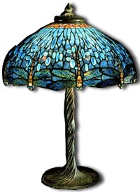
Louis Comfort Tiffany was a painter, Interior designer, collector, world traveler, photographer, manufacturer and avid gardener in his time. Though his father wanted him to succeed him as the head of their company (Tiffany & Co.), Tiffany's real interest was painting. Before becoming a established artist in 1879 Tiffany studied under an American landscape painter named George Inness through the 1860's and 1870's.

In 1879 he joined with other artists to form a firm that would use aesthetic idealism in the practice of interior design. He used stained glass windows in these designs. Tiffany earned international reputation and earned success.


Tiffany started experimenting with glass in 1875 to 1878 as he was working with glasshouses in Brooklyn. This is when he started designing glass-work. His unique style was the one of Art Nouveau which contained of organic shapes, flowers and leaves. On Dec 1st, 1885 he opened "The Tiffany Glass company" which later became known as "Tiffany Studios." He designed glass table lamps, lampshades, glass vases, tiles, mosaics and stained-glass-windows. Tiffany died in 1933 but his amazing Art Nouveau designs are still known today.

Magnolias, c. 1900
Louis Comfort Tiffany
glass, lead

I really enjoy Tiffany's work because it is different. It's amazing how he incorporated the Art Nouveau style into his work; stain glass windows, glass vases, glass lamps. It's amazing. This really inspires me because I am currently working on an assignment in my CyberArts tech. class that has to do with Art Nouveau and it's hard. There are so many organic shapes and so much detail. I have so much respect for Tiffany as he probably worked very hard to get such results!

Louis Comfort Tiffany was an amazing artist.

Wednesday, April 21, 2010

Sprockets Film Festival

Hello Everyone!
Yesterday, my CyberArts class and I went to the Sprockets Film Festival at the Sheppard Cineplex Odeon. There, we watched a series of short films made by Film School graduates and students. These films included a variety of different genres such as animation, documentary and more. After watching these short films (and having lunch), we watched a animated french film called "U".


At the sprockets Film Festival we watched a series of short films; Animal, The Art of Drowning, On the Bus, Forget myself, The Freshwater Plague, Toxic Ingredients, Bonefeather, Iran: A Nation of Bloggers, Nanu and S'oublier. In these films I liked that each film had a different theme, they weren't all the same. I also liked that most of the films had interesting shooting angles. One thing I couldn't help wondering is how they made the animations. Some of the animations were pretty long so I wonder how long it took them to make that 5 minute film, or that 3 minute film. When I watched the film "the art of drowning" It looked really complicated. The maker of the film was also there at the screening and so one of my friends asked him what medium he used. He told us that he used mostly a pen/pencil and paper. Thinking of that it makes me wonder how exactly the makers had patience to make their films. The non-animation films also make me wonder, how they thought of the concepts and how they made their film with the little equipment they had. It's interesting when youthink about it. My favourite film out of these would have to be Bonefeather. This is because it had humour to it and it made me enjoy the length of time I was watching it! The theme of two obnoxious birds fighting over a female bird was very entertaining. It had the whole audience laughing. It was a good pick me up. I also liked the the film included bright colours for the birds to give it a bright and cheerful mood. I have yet to guess what type of medium was used.


The second film that I mentioned we watched was called "U". It was about the friendship of of two beings. A princess named Mona and a unicorn named "U". When Mona was a child she was often upset because she had to listen to the rantings of her guardians (her parents had died earlier), she felt that everything was her fault. Then one day, crying, she met a unicorn named "U". From then on they became sister-like best friends. A couple of years later they meet a family of travelers called the "Yeah Yeah's" which include four siblings and their mother and father. Meeting one of the sons of this family, a musician cat, she finds out what love is. But being in love causes a drift between her friendship with "U"...

I personally really liked the film "U". I can say this french film is different then the western animations we have today. "U" was a bit more open and descriptive with its content. For example; at one part it described kissing. This is different from Western animations because most western animations are meant for children and do not show mature content. Another more obvious difference would be the language. The film used french while western animations mostly use English. There are probably more differences but I fail to see them at this moment, looks like I will have to watch some more animations and compare.

Wrapping it up, I can proudly say that I thoroughly enjoyed my day at the Sprockets Film Festival!

Friday, April 16, 2010

Old Coca-Cola Or New?


Hey Everyone!

I opened my fridge the other day and took out a coke can. I picked it up and looked at it. Then I thought, "didn't it look different before?" So I searched it up and found an images of the Coca-Cola can, before and after. This is what I came up with.

So I looked at the two designs and I think I like the first design better. The new design is nice, but its too simple in my opinion. I preferred the old design because It looked more "WOW". For example, I liked how the old Coca-Cola can used more then one colour with different shades; red, maroon, silver, white, yellow and black. I think it just looks more visually appealing. It looks shimmery and I love the bubbles and patterns on the can. I like it because it's not overly decorated, but it gives the can more character.

I think the newer can isn't as appealing. The only exciting thing about the new can, in my opinion, would be the bold cursive writing.

I think the Coca-Cola company should bring back the old can! :)

Stop Motion Animation

Hello Again!
I was recently on our CyberArts main blog. While looking through some old posts I came across some stop motion animations my CyberArts class and I made at the NFB. Looking at these animations I thought, wow. That took us a long time to make these 10-15 second animations. So I went onto youtube and started looking at random stop motion animations. Some work short and some were long, but all of them were thoroughly entertaining!

One animation I really liked was about a wooden stick figure.

Do have a look!


This animation was about one minute long and was pretty simple. It was done on a white background. The animation was about a stick figure that wouldn't stay in the position that the maker wanted. So the maker (his hand) would come in frequently and try to position the stick figure and make him stay properly. But the stick figure would change it's position. It showed the stick maker getting angry and the stick figure eventually crawled away.

I thought this video was entertaining and funny. It made me laugh. Just the simplicity had a good impact on me because there weren't any thing to distract my eyes away from the main animation.

I hope you enjoyed it! :)

Saturday, April 10, 2010

Photoshop Tutorials :)


Hello Everyone!
I'm here with a bunch of Adobe Photoshop tutorials I have found on Outspoken-kate.com. Outspoken-kate.com in a blog written by a 20 year old girl named Katya. I stumbled upon her blog about a year or two ago when I first started using Photoshop. This blog was a lot of help because it covered a lot of the basics; adding text, blending images, using patterns and so much more. So if you have recently started using Photoshop and don't exactly know how to use it, this blog or website will guide you through some useful steps.

The thing I like about these tutorials is that they include pictures with the instructions. So if you are confused with the wording, you can figure out the problem by looking at the picture. Also, if you do not know if you are following the instructions correctly you can refer back to the images and see if your work and the tutorial images look the same.

I find this blog/website very useful. If you want to learn some cool Photoshop effects or need some simple tutorials, do check out this blog! (You can click on the link above)

Monday, April 5, 2010

Touch the Sky :)


Hello Everyone!
So, last week on Thursday, I went outside to help my two friends take pictures for an assignment we are working on in CyberArts tech. We took the pictures and on our way back to the school we started jumping and taking random photographs.

This is one of the photographs my friend took of me while I was fooling around just jumping. It was beautiful outside so I had a lot of energy. So I guess I jumped pretty high looking at this photo. I didn't really know what this picture turned out like until my friend showed me it on her computer. I immediately transferred it onto my USB key and brought it home. After that I opened it onto Photoshop and did some colour correction using levels, colour balance, brightness and contrast and selective colour. After that I added some wording to the top left corner and there you have it!

I really like this photo because its very surreal, it goes against gravity because it looks like your just floating in mid-air and its funny because I didn't really plan it. You're just jumping up and down and whatever the camera captures, it captures. It's very random, and so that's what I like about it.

I hope you like it and I hope you try it one day! Just grab and camera and shoot while your in motion. It's totally random and you might have some laughs along the way when look at any ridiculous poses that turn up! So Have fun! :)

Wednesday, March 31, 2010

The Western Wall and Jewish Faith


The Western Wall (also known as the Wailing Wall) is an important Jewish religious site located in the old city of Jerusalem. It is important because It's purpose is to mourn the destruction of the old temple; it is the last remnant. The total height of the wall is 32 meters and is 1600 feet wide. It was build among the temple mount in the 10th century and destroyed by the Babylonians in 586 BCE.

Many people of the Jewish faith make pilgrimages to the temple as it is easily excess able and is a very holy spot. The people of Jewish faith wrote their prayers on a slip of paper and placed them in the cracks of the Western Wall. Many people think that those of Jewish faith can not set a foot upon the Temple Mount because it is considered a sin. The Jewish people believe that the temple was created by King David and was one of the first .

When the Roman Emperor Vespasian was in the midst of his take over. He left the temple standing as a reminder of what he conquered. In 1967, the Western Wall was under the control of Israel. During events like Bar Mitzvahs or Jerusalem Day people gather around to pray.

Other cultures besides besides the Jewish faith find meaning in the Western Wall. In the Islamic faith, it is believed that the Prophet Muhammad left his winged steed, Buraq by the Western Wall(they call it Al-Buraq Wall) A few cultures have their own opinions about the Western Wall. Palestienian have their own opinions as does the Jewish, Israeli, and the Egyptians. They have their own opinions about the Western Wall and it's origins.

Saturday, March 20, 2010

Blinkies!

Hello everyone!

March break is almost over, yes there are only 2 days left. So this week, I had a chance to experiment with my Photoshop cS3 and see what new things I could learn. So I played around, clicked random things and tried to figure out what some things were and how they worked. So after a couple hours (daily) of random clicking, I figured out how to make some blinkies. Well, actually I already knew how... but this time I tried to make them more complicated. Some worked, others did not.

So, I ended up making a bunch of avatar blinkies, simples ones with textures and images from google as well as text, personalizing them for some of my friends on india-forums and this is how they turned out:


So personally, I think they turned out pretty well. I think next time I'll try making them a little more complicated; maybe add more flashy text or images. But whatever it is, I want to enhance my abilities and see how much I can improve and how much I can do!

Feedback is highly appreciated! If you would like one of your own, yes I can make you one. :)

That's it for now, but I will be back soon!

Friday, February 26, 2010

Art from my past

Hello Everyone!

Today, I was going through my past art pieces which I found in a folder on my computer in CyberArts class from last year. So I thought I should post it up.


This one of my art pieces from Year 1 CyberArts. It is a simple drawing of a bunny used with conte on a simple large piece of newsprint. I used black, white and brown colours to hatch in the shadows. The white hatching shows the light, the black shows the shadow and the brown hatching shows the mid between the dark and the light. Hatching together, it partially made the picture of my bunny 3D.

I think this is one of my favourite pieces of my most early work, just because I think I did a good job on it and I can see where I need to improve and where I can excel from last year.

I hope you like it! I will be back with another blog post in a couple of days!

Sunday, February 21, 2010

Sparkles in the Snow

I stepped out of my door on tuesday and the first thing that I thought was, "Oh my gosh, It's cold." Not that it should be sweating hot, it is February, but there was a wind chill and I was waiting at the bus stop. But then I looked around and I didn't feel cold anymore. Why? Not because the bus came (because it didn't) but because I saw the snow around me.

It started snowing and in about five minutes the ground was covered in white and more fluffy snowflakes were falling from the sky. Everywhere I looked I saw sparkles from the reflection of the sun on the snow. It was beautiful and I would have taken a picture and posted it up, but I sadly didn't have a camera.

So the moral of my story is, when your outside and your freezing, look around you. Not only will you find distraction from the freezing weather but you'll feel inspired in one way or another. Trust me, it happened to me.

Monday, February 15, 2010

El Anatsui

Hi Everyone!

Today, I am going to tell you about a very popular and known artist, El Anatsui, and his breathtaking art. This is because we will be working with him in the upcoming months as he displays his recent art at the ROM. Not only will we see his work but we will be able to add some of our own. It's an honor and I'm glad to be able to participate in it.


El Anatsui is a world known sculptor in the world of art. Not only is he a sculptor but a professor that has been teaching at University of Nigeria, Nsukka, since 1975. He is known for his creative and mesmerizing sculptors.

El Anatsui was born in 1944 in Anyako, Ghana. He was trained at the College of Art, University of Science and Technology, in Kumasi, Ghana. Although he was born in Ghana, most of his working career was spent in Nigeria. His art has been exhibited and recognized in many honorable galleries across the world; Brazil, Japan, Germany, England, South Africa, the United States and many more.


El Anatsui has worked with many different types of media. Such as wood, clay, ceramic, and most recently, metal. The image above is one of the pieces of his latest work magnificent metallic quilts made of liquor bottle caps. He has taken unused and discarded metal liquid bottle caps, flattened them and stitched them together using wire to make a work of art. Coincidentally, the colours of the caps were similar to those of traditional kente cloths.

Anatsui uses many themes in his art that recur in his artworks, all relating to African history and crafts. His recent message, the message we will work with at the ROM, is about barriers and boundaries of society. He wants everyone to lower the walls; physically, mentally, and emotionally.

His other works include three dimensional sculptures made of scraps he has found, such as food tine, aluminum roofing, metal graters, etc. Though he uses unused materials, he does not think of it as recycling. He believes that he is taking something and making it into something new.


Personally, I am awed by El Anatsui's work. I wish I was able to do what he does with the same passion and skill. I am amazed with the amount of detail and precision he has in his art. My favorite would have to be his most recent work; the quilts made of liquor bottle caps. The quilts are beautiful. I have only seen photographs of his work so I can't even imagine what they look like in reality. After researching and looking at photographs of all his work, I am looking forward to working with him at the ROM. Not only will I learn from this experience, but I will be working with one of the greatest artists of our time.

Wednesday, February 10, 2010

It's been a year...

Hello Everyone!
It's been a year since I last posted! I've been busy with school and things at home so I haven't been able to post. But I'm here now, back in CyberArts for year 2! I will be on more and hopefully post some new and interesting things.

I'm looking forward to writing on this blog and communicating the interesting things that I have learned!

Take Care!